How Office Interior Design Can Tell the Story of Your Brand
A Case Study in Office Interior Design
What I love most about designing offices is that all companies have one thing in common: they have a mission. And when you walk into a rapidly expanding business, one thing is clear — you can stop any random employee — the CEO or the intern, and they’ll have no issue telling you exactly what that mission is. Our belief is that the best design is taking that mission, and making it truly palpable the moment one enters your space.
One of my favorite examples of what I mean is the redesign we recently completed for a really exciting company: nuts.com. When I first walked into their space, I was shocked — the dilapidated and grimy office they were occupying was as incongruous with the cheerful image of the company as you can get. I struggled to see the light at the end of the tunnel: the gap between the space they were in and the image they wanted to project, seemed too far to bridge.
During one of my many chats with the COO, I fished for insights into what of either the history, or the future goals we could cling onto as a jumping off point for our design process. Andrew told me the story of the humble beginnings of this, now, national brand. It was started in 1929 — during the Great Depression — as a nut cart Newark’s Penn Station by the (current) CEO’s grandfather. The family business has been cared for by three generations, and this legacy — of both looking back to their past, and sharing it with the current employees that helped the company grow, and what (in their view) made them unique.
This story was worth building, and so we did. The Depression Era nut cart was the foundation of this legacy, and we wanted to build it into the space. For the office kitchen — the heart of this food company’s space — we created a custom wallcovering which is a printed mural of Penn Station in NYC — built at the same time, and by the same architects as Newark’s Penn (McKim Mead & White), both at around the turn of the previous century. The millwork was abstracted, and became a stand-in for the cart: bright yellow, Formica-clad cabinetry reminiscent of brightly colored vendors in public spaces of eras past, contrasted by the traditional and nostalgic black and white mosaic floor.
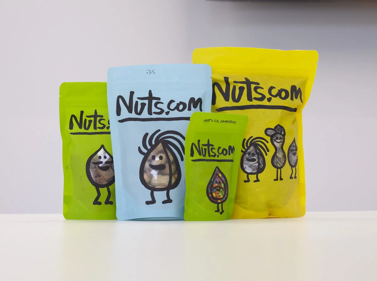
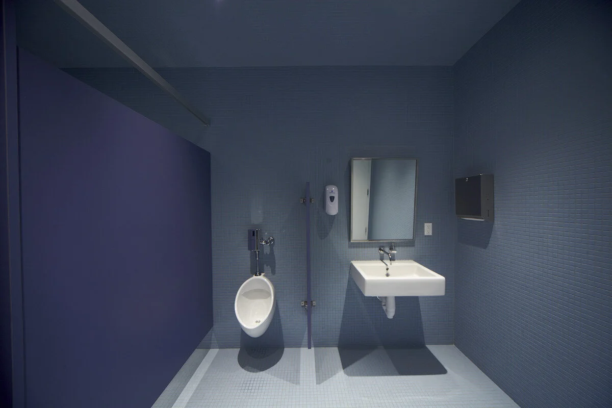
We then carried the theme of exploiting the company’s history, and penchant for color, throughout the space. The company’s packaging, designed by Pentagram, was the inspiration for the color used throughout the remainder of the space. We splashed color all over the bathrooms and used the vibrant hues to tie the spaces together, while defaulting to neutrals — for balance — in the rest of the space.


